The main character within our trailer is young teenager Charlotte. Charlotte is a representation of the stereotype, ‘troubled young woman’ – taking influence from a range of well-known soap characters.
Lucy Beale, a current teenager in soap, Eastenders is one of a character that influenced the creation of Charlotte. Similar to Charlotte she is “stuck between two worlds” (words taken from Charlottes monologue within the trailer) however deals with it by rebelling. Beale has, throughout her time on Eastenders, already been involved in a number on relationships with various stereotypes of rebellious male teenagers such as a ‘Goth’ and ‘Chav’. One of her boyfriends was linked to drugs; this became an influence for Charlotte’s boyfriend Smithy. Lucy has also lost friends over her relationships and rebellion, another influence for Charlotte’s story shown within our trailer. The Beale family is a parallel to Charlottes family, both thinking there ‘above’ the rest of the community in class and power and push their children into academia. However, Charlotte and Lucy differ due to Lucy’s eccentricity; we wanted the audience to sympathise with Charlotte and therefore made her less angry and rebellious. Within the program the symbolic code will be used to develop Charlottes unhappy, controlling home life in comparison to her dangerous and exciting freedom she gains whilst being around her boyfriend and friends to denote to the audience the difference in the two worlds she lives in and her struggle to fit it.
Libby Fox is another key influence of Charlotte’s from Eastenders. Libby represents the stereotypical female, A grade student with Christian morals and a caring heart. We chose this influence for Charlotte as although she does not retain Christian morals she is an A grade student with a caring heart, which shows a more mature and committed side to her, which is not portrayed in the trailer. We chose to use Libby’s good qualities within Charlotte so that the audience would sympathise from with the character when things begin to turn dramatically wrong.
Although the trailer alludes to domestic violence between Charlotte and her boyfriend this was a theme we chose to portray due to current social issues in modern Britain. Domestic violence is an issue that is becoming increasingly recognised in Britain, especially within teenage relationships; like Charlotte and Smithy it is often associated with drug use. We chose this issue as we wanted to include a theme that was relatively new to soap operas, and raise awareness for a crime becoming increasingly noticeable in current media and campaigns. We chose this as after our research into soap operas it Is clear that although they are a form of entertainment they also inform and educate; “ vehicle that can not only entertain but educate” Watching Daytime Soap Operas – The Power of Pleasure Louise Spence. Soap operas are constantly recognised and noticed for raising awareness on controversial, current issues and commended on their compassionate, realistic portrayals.
By choosing for character Charlotte to fall pregnant and consider suicide we took influence from a character Katy Harris in the early 2000’s of Coronation Street, a girl who fell pregnant after a range of difficult situations in her life. She argued abortion inside her head for a long time due to her worry about whether her partner would stand by her, this is a direct influence to Charlotte. Katy in the end choses abortion and then realises she’s made the wrong decision, this was something we did not include in Charlottes story as we did not think it was fitting with her character. As she is a clever, intelligent student we realised that unlike Katy she would not make any rash decision. However, also like Katy Charlotte commits suicide because of all the trauma she has endured. Although Charlotte does not have an abortion, like Katy her pregnancy is a huge influence on her death as she chose’s to die with her baby because although she wants to continue her pregnancy she no-one to support her.
We chose to use such memorable and controversial influences for our main character Charlotte was this meant we had proof they worked. We further developed the character to keep things fresh and interesting for our audience, and portray a range of current issues to educate and raise awareness. Our method behind using such a traumatic opening storyline, based all around one teenage girl is that it will attract a large percentage of audience through sympathy. The trailer has been produced in a way which instigates a relationship between audience and character whilst with-holding information that they have to watch the program to find.
This course has worked through the use of three key adobe programs: Indesign: Photoshop and Premier Elements 3. My skills in each program have developed since the beginning of the course, especially the print based programs and I now feel competent in using all three programs.
I have previously used the program Premier Elements 3 during my AS coursework and therefore had a basic understanding of how to operate the program before we began editing. However, throughout the course I have learnt a variety of new editing techniques which were helped along by my further knowledge in film e.g. the aesthetics of a finished piece. Some of the new skills I have learnt include speeding and slowing shots, an example of this is the tracking shot along the high street within the opening montage, which has been speed up (see right image). Within the montage in Charlotte’s bedroom, various shots have been slowed down to emphasise her emotional state, creating a tense atmosphere. Another technique I have learnt and used within the trailer is the manipulation of transitions, making them longer or shorter, allowing the continuity of the trailer to flow appropriately to the pace. The mock CCTV shots used within the trailer also demonstrate more advanced skills, the numbers run up accurately in seconds in the left corner and one shot uses a screen spilt into four (see left image). I learnt a lot about sound manipulation within the A2 coursework, something I had little experience with, I learnt as I worked trying and varying a range of sound editing techniques until finding one that did not disrupt the continuity of the trailer, and created the appropriate atmosphere. I hope that my improved skills will work in my advantage to make the trailer look professional and unique, therefore attracting a larger audience.
Photoshop was another program I had basic, knowledge on from previous use. Photoshop was the program that we used the least, using it mainly to isolate text from its background meaning it could be transported straight onto our poster or magazine cover. I also used Photoshop to change the colour of my text and create some of the shapes used within the magazine cover, such as the star puffs in the bottom left corner.
Indesign was a program that prior to the course I had no experience in using. At first I found it really hard to operate, struggling to create the mock magazine covers I practised on. Once I began to work on our own magazine cover the basic became easy to use. Primarily my main confusion was the different layers you have to create and use, however through the use of trial and error I managed to improve my skills and actually found that the use of layers made using the program easier when trying to delete or move an object. Another advantage of using Indesign is the frames you use to paste in your picture, the circular frames allowed me to incorporate a circular theme on our magazine cover, connoting life and death – a theme linked with the main feature. The layers and frames allowed me to manipulate our main image so that it fit the visible frame at the bottom but was layered over the visible frame at the top (see left image). The program also allowed me to create a highlight and shadow around text, a technique I used to make the media appear more professional (see right image).
Emmerdale is broadcast by ITV and run for approximately 22 minutes excluding advertisement breaks. It is broadcast weekdays at 7-7.30pm with and extra episode on Thursday, 8-8.30pm. Since its first episode in 1989 there have been around 5850 episodes of Emmerdale in total, capturing a wide and loyal audience. Emmerdale’s highest ever viewing figures occurred in December 1993 when 18 million viewers tuned in to see a plane crash into the village killing four characters. During their high profile storylines Emmerdales viewing figure reach anything from a lowest of 6.09 million viewer’s to high of 10 million viewers. However, since other soap operas such as Eastenders and Hollyoaks have begun Emmerdale viewing figures during high profile storylines have dropped as opposed to their original hits of ten or twelve million. Emmerdale is currently sponsored by Tombola Bingo, an online bingo site, it has been sponsored by other famous brands such as Heinz salad cream, Lemsip and Calgon.
Coronation street is also broadcast by ITV and on 17th September 2010 celebrated becoming Britain’s longest ever running Soap Opera. Same as the Emmerdale format the soap is broadcast for 22 minutes excluding advertisement breaks yet runs on different days – twice on a Monday, on a Thursday and a Friday. Since the first episode in 1960 there have been approximately 7660 episodes to be broadcast in the UK, watched by a vast range of people and generations. Coronation Streets highest viewing figure to date occurred in 1987 when 28.5 million viewers tuned in to see character Hilda Ogden leave the street, at the time this was equal to almost half of Britain’s population. On average now Coronation Street attracts at least 8 million viewers, peaking to 14 million during a high profile storyline. Coronation Street is in constant battle with BBC soap Eastenders for first place in rating yet both soap operas are announced Britain’s most watched shows. Coronation Street has only ever had two sponsors, Cadburys which sponsored the soap until 2007 and Harveys, a sponsorship that it still on-going.
Eastenders is broadcast by the BBC and runs for 27 minutes, unlike Emmerdale and Coronation Street the BBC do not use advert break as they are funded by the government. Eastenders is currently broadcast on a Monday, Tuesday, Thursday and Friday in Britain and has almost reached its 4200th episode since it began in 1985. As previously mentioned, Eastenders is locked in a constant rating battle with Coronation Street yet both remain amicable with each other, working television schedules around each other best they can to ensure high rating figures. Eastenders made ratings history when 31.5 million viewers tuned in over Christmas 1986 to watch character Den Watts divorce his wife Angie, this is the highest viewing figure for a soap opera in British history. On average Eastenders now hold rating of approximately 6-8 million viewers, reaching highs of twelve during prolific storylines. During 2004 Eastenders saw a dramatic drop in ratings reaching lows of 4 million, similar to this was there decrease in 2007 which again reached lows of 4 million. As Eastenders are funded by the government watershed rules are stricter and content and realism with storyline is watched carefully and no sponsorship is needed.
Hollyoaks is Britain’s newest popular soap, being shown weekdays at 6.30 it has nearly reached its 3050th episode. Unique to Hollyoaks is its regular use of incidental music to bridge together scenes or enhance atmosphere during certain storylines. Hollyoaks attracts an audience’s of around 1.5-5 million viewers, attracting more of a youthful generation that other soap operas. Hollyoaks is currently sponsored by Nixon Coolpix, a sponsor that has returned to them after an increase in sales through sponsoring the soap.
Our Advanced Portfolio task was to produce a Soap Trailer as the main task and to produce a Soap magazine and a poster as my two Ancillary tasks, it involved intensive research into the world of soap operas including their institutions and marketing strategies. Once the research was complete, in a group of three, we created our own unique soap opera called Cliffside; including possible storylines, character breakdowns and a poster, magazine front cover and trailer advertising the new soap. We used a range of programs, including Indesign and Premier Elements to create our pieces of advertisement and complete them to the best of our ability.
Before the creation of our Soap Opera we studied Soap Operas in general, looking into their vast history and their rightful place in British popular culture. The first televised British Soap Opera still running is Coronation Street beginning in 1960’s, this soap was crucial too research as it has gained and maintained high viewing figures throughout its broadcasting years and plays a part in some viewers daily routines. After studying a combination of Britain’s five most famous Soap Operas the important conventions become clear, along with their appeal to an audience. Coronation Street, Eastenders, Hollyoaks and Emmerdale are all set in well-known British cities by the creation of a fictional town, they all base their characters around the working class community and include a range of controversial, realistic social issues. Brookside the fifth soap opera became defunct as it challenged the stereotypical conventions of a Soap Opera and pushed them too far, the down fall of the program is believed to be brought about by a large decrease in viewing figures due to the middle class community and far-fetched storylines. This research taught us that realism and a working class character base is one of the main conventions that engage the soap operas audience, they connect with the various stereotypes represented in the storylines as they see similarities between themselves and the fictional character; “…takes them into their own problems … or problems worse than their own”, Watching Daytime Soap Operas – The Power of Pleasure Louise Spence.
Our research also lead us to the importance of keeping the Soap Opera up to date with the time the audience views the program. Soap Operas are often filmed around 6 month’s ahead of the actual broadcast, so that it becomes much more realistic for the audience. Well known British issues can be added in at a later date before the broadcast to once again make the Soap more believable for the audience. This also transfers to the storylines, it is important that the writers include controversial and fresh social issues to keep the audience interested, Soap Operas are seen as a “ vehicle that can not only entertain but educate”, Watching Daytime Soap Operas – The Power of Pleasure Louise Spence. The inclusion of taboo issues is always expected within Soap Operas and in turn they are often commended for their well-thought and researched methods of conveying the chosen issues. A well-known storyline in Eastenders was the child abuse storyline that ran between Kat Slater and her uncle, the Soap won many awards for their respectful representation and awareness rose about such a common, yet ‘silenced’ issue in Britain. By including ‘up-to-date’ storylines audiences often find themselves turning to Soap Opera’s for guidance on everyday issues such as divorce, they offer a release from a viewer’s own problematic life or advice and comfort via their fictional characters on issues that occur in many people’s lives.
Considering these two crucial conventions of Soap Operas we both developed and challenged this by offering our audience an original twist on the basic elements. Unique to our Soap Opera is the setting, a fictional seaside town called Cliffside based in Norfolk however, in keeping with our audience’s needs the Soap Opera is based around a working class cast. Our trailer promotes a range of modern social issues to interest our audience such as suicide, relationships with an age-gap and teenage pregnancy furthermore, it portrays a realistic look at less traumatic events such as failing at school and losing friends. Our soap opera also challenges the conventions of Soap Operas by using a mostly youthful cast, similar to Britain’s newest popular soap, Hollyoaks. We wanted to create a Soap that re-establishes a youthful audience with British Soap Operas, we aim to do this with a large teenage-based cast and one of the main forums being a local college. Due to there now being such a vast diversity in television channels and programs soap operas often find it hard to reach the high viewing figures they retained in their earlier years. We want to create a soap opera that interests a high percentage of British youth, if this works the program will gain a loyal base of viewers that watch the program on going with time, “ within soap operas we have a narrative text that might have been begun by a reader in adolescence but which, thirty years later, is still being read by the same reader” (Imitations of Life : A Reader on Film and Television Drama – Marcia Landy).On the other hand, Cliffside offers the conventions which attract the stereotypical soap opera audience of older generations by the diverse range of stereotypical and countertype families which will deal with a range of small and large realistic problems. The character breakdown produced boasts the Soap’s diverse range of characters, with stereotypes that the audience will find easy to immediate relate to and countertypes to keep the audience interested and guessing, a parallel to the hermeneutic code often used within Soap Operas. Along with this is the inclusion of the stereotypical forums which boast to be the heart of the fictional communities, a café and pub. The BeachCafe! and The Sub. are such forums included in Cliffside, the names chosen in keeping with the setting to promote the Soap’s uniqueness. We chose for the Cliffside to be produced by the institution, Channel Four based on our research of on-going British Soaps and research into the channel. Channel Four is a channel know commonly for its taboo and realistic programs, dramas and documentaries that focus of the gritty realism of modern life. We wanted our soap opera to be part of this channel and ‘genre’ of television as we feel it will attract the highest viewing figures. It is also the home channel of the popular television series Skins, a program which is watched by a vast youth audience and which has become a key influence when creating our Soap Opera advertisements.
To create our Soap trailer we used the program Adobe Premier Elements 3, due to the AS coursework task and GSCE media I had previous experience of the program and knowledge on how to work it. The program, although basic, allows you to edit your chosen footage and discard the bad footage; it allows you to add a range of transitions and pictorial effects to your chosen footage, add non-diegetic soundtracks and speed or slow footage down, in turn, we used a range of all these techniques to promote our new Soap to the best of our ability. Unlike the actual episodes of Soap Operas, Soap Opera trailers often used a wider variety of camera shots and angles in comparison to the usual eyelevel two-shots, mid-shots and close-ups: “the world of Soap Opera is spatially through the close-up and the two shot” (Women and Soap Operas – A Study of Prime Time Soap
Soap Stories by Robert Allen). Along with this parallel soundtracks and superdiegetic speech is often used in trailers yet rarely seen in episodes, two techniques we chose to include within our piece through the help of Premier Elements. The trailer we have created has been filmed and edited to the best our ability to promote our new Soap Opera and attract potential viewers.
The Trailer
Influenced by trailer we have looked at such as Coronation Streets, The Return of Tony Gordon (see video above) we wanted to keep the pace of our soap opera quick and in rhythm with the parallel soundtrack. The difference between this trailer and ours is that Coronation Street is promoting a storyline about already established characters to a loyal and aware audience, our trailer has to promote a storyline, introduce characters and attract potential audiences, this will create a difference in our trailers content and length.
The trailer opens with a montage-like section which shows a range of Cliffside’s forums and popular scenery, in the bottom left corner in a simple, white font is the phrase “Coming Soon”, a denotation that this is a new program. A fade to black transition links the shots and introduces the trailer’s fast pace, the seaside setting is immediately introduced via a range of wide angle shots featuring the beach. Within this montage is a wide, high angle shot of a school ‘common room’ (see left image), the shot has been edited to mock a CCTV camera, by being spilt into four parts, in black and white with a time and date in the corner. This shot was chosen to attract the audience’s attention as it connotes both realism and secrecy, which introduce an element of excitement and suspense to the trailer. The next shot is a tracking shot of the town’s main street (see right image), this shot boasts the same techniques as an establishing shot; it shows both sides of the street to introduce the audience to the setting, featuring the shops and café’s which will later be developed within the Soap Opera. This shot has been sped up and the lights within it treated, this is to make the setting welcoming and appealing to the audience, the lights connote a happy, exciting atmosphere and use the culture code as the audience is triggered into thinking of their own memories surrounding beach illuminations.
The second scene is then introduced via the transition of a cross zoom, the continuity of the piece is kept smooth as the treated lights in the previous shot link directly to the red lighting used in this party scene. Once again a tracking shot is used to introduce a range of characters to the audience, the characters are teenage girls at a party, this also introduces a friendly, fun relationship to the audience, developing the welcoming atmosphere already created. The warm lighting connotes the love and warmth often shown between communities within soap operas and the characters costumes establish the time frame as present day, two key conventions of soap operas. The BeachCafe! is the forum included in the next scene which features two characters Charlotte and Ella, the basics camera shot are used such as two shots and over the shoulder shots to follow a conversation which explains to the audience Charlotte has been absent from school; within the conversation the theme of secrecy is developed as Charlotte declares she is “not the only one keeping secrets”. The characters both wear costumes stereotypical to their female teenage characters, confirming that the Soap is set in present day. The next scene introduces a housing estate to the audience, the colours within this scene are naturalistic and along with the pathetic fallacy a happy, light atmosphere is developed. However, this is contrasted with the action on screen, through the use of long shots, close-ups and zooms the first controversial storyline is introduced as Charlotte catches her friend kissing an older man. The girl wears only a baggy jumper whilst immediately connoting a sexual relationship with the man she kisses; the man is wearing a suit which connotes his age, therefore introducing the taboo subject. The camera flicks between the couple and Charlotte showing that their relationship had been a secret, the action then cuts to a high angle long shot of the girl sliding down her front door – the superdiegetic sound bridge “You don’t understand, I love him!” is heard, this is influenced by the sound bridges used in the Tony Gordon trailer which create suspense amongst the audience. This set of actions connotes a breakdown in relationship between the two friends and interests the audience by creating suspense as to whether or not Charlotte will keep their secret. As the two scenes have both included the character Charlotte and within them a breakdown in to relationships have been shown the audience’s curiosity will be centred around the character as they try to guess whether she is a ‘bad girl’ or the victim in the storylines.
The curiosity is further developed as in the next scene the character Ella is re-introduced along as another teenage girl, called Maisie asks her if she has “noticed anything weird about charlotte”. Within this line is a match on action shot of Maisie playing with a television remote, this connotes she her discomfort as she is nervous about asking this question as is worried about her friend, this increases the audience’s curiosity as they continue to try and create a persona for Charlotte. However, in keeping with the scene between Ella and Charlotte, Ella retorts that Charlotte “is not the only one with problems”. At the start of her line an extreme close-up is used showing only the characters lips to exaggerate the character’s anger, once again the audiences suspense is heightened as they try to link the scenarios together guessing at potential storylines and themes.
A long shot shows Charlotte and her boyfriend hugging outside, the shot offers a temporary release from the previous negative scene yet is quickly contrasted by a mid-shot which then shows Charlotte and her boyfriend in mid-argument. The diegetic shouting from her boyfriend can be heard as he tells her he “can’t stop”, once again the speech within the scene leaves the audience in suspense, offering a snippet of the storyline and asking them to develop their own ideas on the rest until the program is aired. The shot then switches to a long shot which has been edited to slow motion as Charlotte is pushed by her boyfriend (see left image), this introduces sympathy for Charlotte’s character as the audience begin to relate with her difficulties. It uses the semantic code to develop her boyfriend’s stereotype as the audience pick up on the connotations linked with domestic violence, the hermeneutic code is also at work here, leaving the audience guessing as to how far the violence develops. She is dressed dark colours for this scene representative of her low mood to connote deterioration in her happy character. The scene continues with a range of close-ups which reveal that Charlottes boyfriend is addicted to drugs, a second controversial issue introduced to attract high viewing figures. Combined with the close-up that denotes drug-use is the superdiegetic sound “because I need it, I cant stop”, the sound is distorted similar to the sound used in the scene where charlotte discovers her friends secret relationship to increase suspense and create a sense of sympathy for the character.
The trailer reaches a climax within the next scene as Charlottes character is further developed. The scene starts with an introduction to Charlottes mum as she reveals though diegetic speech that Charlottes “teacher’s rang”, her angry tones connoting that the phone call has brought bad news. A match on action shot shows her mother tapping the phone in her hand, keeping with the fast pace and developing the angry atmosphere created. Following this is a montage showing Charlottes turmoil within her bedroom, the lighting within this scene is low-key connoting her mood, parallel to the dark atmosphere that the trailer now develops. Charlotte is wearing a shirt previously seen on her boyfriend, connoting a good relationship and that on her part she loves and trusts her boyfriend. The montage use’s short, fast close-ups which have used slow motion to exaggerate her movements making evident the characters upset. A birdseye view shot is used within the montage to show Charlotte on her bed (see right image), still and pensive; this shot makes the character appear much more vulnerable and younger increasing the audience’s sympathy for her. The montage ends with a close-up of a mobile sending the message “I’m pregnant”, the audience immediately picks up on the indexical reference that its Charlotte sending the message and further develop a relationship with the character as within the first few minutes of the trailer they have watched her life go from good to bad. This is the first firm introduction to a popular Soap Opera stereotype, the troubled young girl – a stereotype common within all Soap Operas, a favourite character that offers escapism distracting viewers from their own problems and lives.
The next scene introduces another character from the soap, Mr Bretnall. The suspense is developed through a fast paced montage which follows Mr Bretnall’s walk to the classroom in which Charlottes waits; a variety of camera shots and angles are used to the tension between the characters growing. Within this montage, similar to the introductory montage is a shot that mocks a security camera (see left image); we chose to use this to create a sense of foreboding and further develop the tension. A typical 180 degree rule is followed to show the conversation between Charlotte and her teacher; a slight high angle is used when the camera is on Charlotte and a slight low angle is used when the camera shows Mr Bretnall, this establishes the positions of power and also highlights that Charlotte is still a child to the audience, increasing their sympathy for the vulnerable character. During the conversation it appears that Charlotte is considering revealing to her teacher her troubles, parallel to this the camera zooms in on both characters, heightening the viewer’s excitement, which is then lost as Charlotte gets up and walks out.
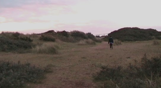
The final scene within the advert is the most dramatic scene that is included as a final attempt to interest potential viewers by introducing another serious theme. Within the scene Charlotte is once again wearing dark colour’s parallel to her dark mood, black also has connotations of death which causes the viewer to begin to contemplate if this is another theme that will appear. Also visible within Charlotte’s costume once again, is her boyfriend’s shirt – this trigger curiosity with the audience as they begin to guess what has become of their relationship. This scene uses a range of long shot and mid-shots to show Charlotte walking to a path way by the sea (see right image), once there, a range of close-ups are used to show that she is disturbed and upset. One close-up uses shallow focus, isolating Charlotte from the background and it is clear that she has make-up smudged all down her face, denoting she has been crying, this technique also makes her appear more vulnerable and hyperbolically connotes her loneliness (see image above left). This is a new side of Charlotte shown to the audience in contrast to the stubborn character represented in the previous scenes, as its clear to the audience she is upset and from the trailer they have already began to sympathise with her the suspense is once again developed as the audience begin to guess what she will do now. The scene then follows her as she climbs over the railings on the pathway and up onto the tallest rock, alongside this a non-diegetic monologue begins from Charlotte’s character (see image below). The monologue reveals all Charlotte troubles and feeling directly to the viewer, the trailer ends with a proairetic ending, as although the semantic code eludes to her suicide the audience do not find out and therefore have to watch the program to seek the truth.
We chose to create our trailer based around one central character and her troubled life as we wanted the audience to begin to form a relationship or feelings about Charlotte. Throughout the trailer it appears that she is losing the things she loves the most and this is the heightened in the monologue when she reveals that she is pregnant and alone as no-one will support her choice to carry on her pregnancy. We chose such a traumatic, realistic trailer as we wanted to attract a diverse audience of age, ethnicity and gender; a range of different themes have been shown within the trailer so that each demographic has something to relate too. The ending, although connotes Charlottes suicide, was chosen so that the viewer would watch the program to see whether the character actually does die and also to watch Charlotte’s story unravel from the beginning. Such controversial issues were chosen as Soap Operas are viewed as “vehicle[s] that can not only entertain but educate” (Irna Phillips 1994, Watching Daytime Soap Operas – The Power of Pleasure Louise Spence) and are constantly commended for their achievements in raising awareness about ‘taboo’ issues with realistic representations. Whilst soap operas remain realistic to popular culture, what is sociably acceptable and act as a microcosm of working class, modern British communities they also much the boundaries of realism through storylines, characters or relationships. Examples of this are the recent ‘Baby Swap storyline’ from Eastenders that has been strongly mediated and received around 84 000 complaints yet remained within good viewing figures. Although not to this extreme we have chosen character Charlotte, an A grade stereotype with strict parents who is involved with a male, the complete antithesis to her stereotype, and a wide variety of raw social issues that the audience can go learn and be interested in.
The Poster
Our poster was created on the program Adobe Indesign as the main focus was the image. We learnt how to use Adobe Indesign during the coursework task as we also used it for our magazine cover, although the use of it whilst producing our poster was much easier. The program allows you to build up layers yet for our poster we only used two due to the simplicity of our design.
As Soap Opera posters are rare we looked at our other television influence skins when creating our poster. Skins is a popular television series based around youth culture, also broadcast on channel four it represents a realistic, gritty insight into a modern world of teenage life. We looked at a variety of skins poster before deciding upon our main influence, a poster promoting their most recent series (see left image). We chose this poster as our influence because although it is simple it is eye-catching. The simple linear formation allows the reader to interpret the characters for themselves whilst being influenced by the stereotypes represented; the costume and body language are crucial within this poster as this develops the character’s making them easily identifiable.
Our poster uses a similar simple formation although the characters are stood in two lines so that the camera is closer and their expressions easily visible; this is key, as the happy picture is contrasted by the tear straight through the middle and lexis in the top left corner (see right image). Within our formation two relationships are immediately connoted through the characters body language, Charlottes friend and older man at one end whilst Charlotte and her boyfriend stand at the other. The poses contrast each other as Charlottes friend and ‘boyfriend’ stand in a pose that shows them happy, close and ‘in love’, whilst Charlotte and her boyfriend are both smiling they are not stood as close and her boyfriend is leaning on her shoulder connoting power and control. This would immediately be visible to a reader and they would begin to turn the characters into 3D by conjuring possible storylines. The clothes worn by the character make it easy to establish the present, modern time frame and pick out stereotypes such as jack the lad and ‘it’ girl. The picture which at first glance connotes happiness has been clearly torn in half and placed onto a black background; the connotations of this set-up immediately connote broken trust and hurt. In the top left corner the soap name, ‘Cliffside’ is written in a clear white font; underneath “the secret’s out” is written in italics in a font that parodies hand writing, this connotes to the reader that someone in this group has either been betrayed or is about to betray everyone. The atmosphere created is negative and plays on the readers dark side to interest them into watching the soap opera, the simplicity of the poster creates suspense and curiosity teasing them into watching the soap opera to find out more. It plays on the reader’s mind by juxtaposing two themes friendship and betrayal, both themes a realistic part of everyday life that the audience can easily relate too.
Our magazine front cover was created using two programs, Photoshop and Adobe Indesign. Although we learnt to use Indesign whilst creating our coursework pieces, we had previous experience and knowledge of using Photoshop. The two programs were compatible as they enabled us to use different techniques ensuring our final front cover was created to the best of our ability. For example, Photoshop allowed us to isolate text and pictures from its background meaning the paste onto our front cover was much less pixelated and obvious. Adobe Indesign allowed us to layer our front cover so that we could chose to overlap different pieces of text or picture within our piece.
When creating our front cover we analysed a range of various already established magazine covers and their lay-outs to ensure that our front cover was produced using the stereotypical conventions of an actual published magazine. Within the front covers we established that the main background colour used is a form of blue, due to the welcoming connotations and also connotations of trauma and sadness, common themes within soap operas.The main image within television magazine covers are always staged, this shows a more neutral representation of the character and means that less hints are given about the featured storyline creating a sense of curiosity. The masthead is normally shown in a large, block, sans serif font and layered over the main image to show the link.We realised that we must carefully consider our main feature as this would be the foremost promotion that the reader would pick up on, the lexis masthead and tagline must trigger the reader into thinking about the soap and guessing possible storylines.
Influenced by the ancillary texts the background of our magazine front cover is a welcoming blue, we chose this colour due to its connotations of relaxation and sadness, two theme’s current within Soap Operas.Our other features uses the coloursyellow, pink, white and black as they contrast against the blue background, making information easy to locate and read. The inclusion of pink, blue and yellow also directly links to our target audience, we aim for both our soap opera, magazine cover and poster to appeal to a diverse audience – by using blue, pink and yellow we hope to appeal to all genders. The circular format was chosen in relation to a television magazine cover we studied (see left image). We liked the interesting layout of the circles and believe this will give our cover a unique and original appearance in comparison to others. The circle relates directly to ‘soap bubbles’ on a literal meaning but the connotations of the circle format is the ‘circle of life’ a parallel to soap operas and their direct link to following characters from birth to death, offering a realistic view of working class, modern life.
The logo for our television magazine was created in keeping with the circular format and is featured in the top left corner, a common position for the title and logo of a magazine (see right image). The pink background has connotations of love which is used to portray a love for television – it is also a bright welcoming colour that is in keeping with the tone of the magazine cover. The lexis “TV” is shown in the largest font, a direct link that this is the main importance of the magazine and therefore, the main topic of the magazine. The pragmatics of our logo tell the reader that the information within this magazine is exclusive and honest, it tells them that the information given in the magazine is the most they can read upon the topics discussed. Above the logo, in the circle is the phrase “your weekly television guide” – the syntax of the sentence means that the inclusive pronoun comes first showing that the reader is the main importance of the magazine – it makes the reader feel part of a ‘group’, as if the magazine has been produced with them, personally, in mind; it is also in keeping with the chatty tone created by the magazine front cover. The lexis “guide” rather than magazine was chosen because the pragmatics of the lexis “guide” are much softer and once again, connotes that the magazine is reliable, honest and helpful.
The front cover has three smaller features, two of which link directly to the new soap ‘Cliffside’. They are shown in a circular format, linking to the main feature and its connotations. The colours yellow and pink are used around the outside of the circles in correlation to their connotations and features represented; for example, the feature about Tom and Jade has a pink outline, a direct connotation to love and romance (see left image). A simple white block font is used for the taglines, making the information easily visible and accessible for the reader. Similar to the main feature a staged image is used for this feature to not hint further at the storyline, within these shots facial expressions and body language are crucial, as shown in the feature with Tom and Jade where there body language directly connotes annoyance and a turbulent relationship.
In the top right corner, and bottom right corner of the page are two star-like puffs which are shown in yellow to connote the happiness and excitement about the topics within. The exclamations used in both create a sense of excitement for the reader, in keeping with the chatty, informal tone and making them want to read more and both have taglines which tease the reader by offering more information inside about these exciting features; these two techniques have been incorporated to make the reader more likely to buy the magazine. Both puffs are shown in the same format due to the similar theme within them – not only were the shapes and colours chosen do draw attention and because of the parallel connotations but because they both look like parody’s of a medal, which links directly to the competitive theme referred to in both.
The image of the main feature is shown in a circular format, in keeping with the theme that runs throughout. This is important within this feature as the connotations of the circle, life and death, are appropriate to this character and the opening storyline. The character is looking directly at the camera and smiling, this was chosen instead of a glum facial expression as it is more welcoming to the audience and therefore more likely to attract their attention, and in turn more likely for them to watch the soap (see right image). It also connotes that the soap opera is fun and exciting, an feeling that will transfer onto the reader making them excited about the new soap. The girl is dressed modern clothing stereotypical to a teenage girl, this highlights her gender making her appear more vulnerable and emphasising other personality traits associated with her age and gender. The white background is used to connote innocence, parallel to the stereotype the magazine aims to create for the character so that her storyline will then shock and interest the audience. Both the circle and image are edited so that a shadow is visible, a technique added on Indesign – the effect the shadow behind the character is the connotations to a darker side to her in comparison to the ‘happy’ girl represented.
The first pink box, highlights the words “Cliffside, New Soap!” in the colours yellow and white. The title of the soap, “Cliffside” is shown in a yellow font parallel to the sunshine linked with the seaside setting. The pink box is used due to its connotations of love, a central theme within the opening storylines and throughout the soap opera. The phrase “new soap!” is shown in a larger white font to help promote the soap make it visible to the reader (see left image). The syntax of the exclamation names the soap first meaning making it easier to remember for the reader. Underneath this the masthead is visible in colour and font stereotypical to the format of television magazine covers. The lexis “secrets” was chosen as the masthead because it will trigger the audience to begin to imagine possible situations which will be influence by other soap operas, cultural references and expectations of society today. The inner yellow colour has connotations of sunshine, parallel to the setting and connotations of happiness, parallel to the character however, this is juxtaposed by a thick black outline. The black outline contrasts against the yellow connoting things may not be what they seem and giving the feature a more sinister tone this links directly to the happy character shown in the staged image and the foreboding shadow behind her. It immediately makes the reader curious about the character, making them want to find out more. Underneath the masthead is a tagline, shown in a pink box making it easily accessible to the reader and highlighting that extra information surrounding the topic of “secrets” is being offered. In a simple white font in the interrogative “Can Charlotte handle the truth or will the secrets come out?”, this immediately develops the readers interest and curiosity by naming the character in the image as Charlotte. The interrogative also interacts with the reader by asking them to question and think about possible scenarios and storylines. The lexis “handle” was chosen as the pragmatics of the word allude to the possibility that Charlotte is some sort of turmoil and things are getting to much – it creates a cliff-hanger between the information and the first episode meaning the reader is more likely to watch the soap opera and find out more.
The Magazine
Our magazine front cover followed all stereotypical conventions of the ancillary texts, instead of creating a stylistic piece the magazine cover uses the advertisement and promotion of the new soap as its main focus to sell both the magazine and new Soap Opera.
The trailer and ancillary texts are all linked through a main central theme: “secrets”. Our main influence to link together all three media’s was a quote from an article looked at within the research stage: “Soap Opera is ubiquitous … Soap opera is always present, immediate, engaging with its audience, providing stories for newspapers and other television programs, leading its way into popular culture” (Soap Opera by Dorothy Hobson, Histories and Theories). The media’s link together as they all promote the new soap ‘Cliffside’ by the exciting opening storyline; as the character Charlotte is made central by the time the program is broadcast the audience will already have formed their own opinions and feelings on the character, creating a relationship. All media texts use the hermeneutic code, including scenarios that leave the ‘story’ unexplained to keep the audience interested, by developing their curiosity to a point where they begin to create possible storylines. The medias all use varieties of equilibrium and disequilibrium to create a happy, friendly atmosphere which is then contrasted by a dark theme shown by either lexis, graphology or another theme. As the media’s are all so closely interlinked Cliffside would immediately become a recognised soap opera.
The trailer, as it is broadcast by Channel Four, would mainly appear on Channel Four and channels interlinked with this company such as ‘E4’ and music channel ‘The Hits’, this would reach a diverse range of ages. The soap would mainly be advertised after 5pm when people begin to finish work, or relax, heightening its possibility of being seen by a higher viewing percentage. Our influences, Skins and Hollyoaks reach audiences of around 500,000 to 5 million, peaking during more prolific and expensive storylines. In January 2010 Skins returned to Channel Four’s brother channel, E4 attracting ratings of around 1 million viewers at the late time of 10pm. Based on research into our two influences, and taking in consideration of the advertising campaign, broadcast time (8pm), broadcast channel (main channel, Channel Four) and vast amount of channels now accessible to the public, we estimate that Cliffside would attract around 2.5 million plus viewers. Channel Four promotes a range of sponsors for its main featured programs with the sponsors linking either to the program itself or target audience (see right image). We would hope Cliffside would be sponsored by a versatile brand accessible to all our target audience, including different ages, ethnicities and genders. The poster would be featured within a range of magazines, with the main focus on television guides. The poster would be the first form of media to be published as this could be published up to a month prior to the soap beginning, whereas the trailer would begin around two weeks before and the television front cover one week before. The poster would also be featured in a range of other magazines such as gossip and celebrity magazines, fashion magazines, ‘real-life’ magazines, teen magazines, various music magazines, gaming magazines, sport magazines and other popular male magazines such as FHM. This would ensure a wide target audience is instantly used; the advert would take one whole A4 page making it easily visible and eye-catching to the reader. The magazine front cover would be the last media from the advertising campaign to be released to the audience, reaching an already established audience who would want to know more about the soap and the regular buyers of the magazine.
Although not a problem one of our main issues when creating our Soap trailer was location, as we live in an urban area we travelled away for the weekend to film the scenes that would include seaside scenery. During the filming we filled two tapes with footage both from our storyboards and other spontaneous footage so that we could then work with the best bits during the editing stage. As it was not possible for us to go back and re-film pieces it was crucial that we made sure basic techniques such as a use of a tripod, checking the sound and ensuring the camera did not wobble were completed. Our final scene within the trailer shows main character Charlotte committing suicide; this was problematic as we used a public footpath therefore began filming at seven o’clock in the morning to guarantee that no people would be seen in the background of any footage. We also had to ensure that climbing up the rocks would be safe so practised it meaning that the transition would be smoother and the character would not stumble. Another problem we encountered whilst filming was the participant of other characters, the scene that involves the characters Maisie and Ella had to be re-filmed three times, each using different characters due to peoples extra-curricular and curricular commitments. Another problem we encountered due to the participant of other characters was the poster, the photograph used within our final product was a photograph that we took then decided to discard, yet due to deadlines and the involvement of other people a reshoot was not agreed and we used the best photo from the original shot. The main impracticality when creating the magazine cover came from the little experience our group had when using Adobe Indesign however, this was overcome through trial and error and to keep trying all the possible techniques. By choosing a Soap Opera that has a large teenage cast and uses a college as one of the main forums filming within and out of lesson time was easy, as we used a member of our group for the main character Charlotte, the footage involving her was easily filmed around our schedule.
Having finished all three media texts and my blog work I am happy with the overall outcome of my research, planning and creations. I feel that although my research and planning section could have been stronger but I created the blog and each section to the best of my ability at the time. I enjoyed learning about all the different conventions of a Soap Opera , my favourite section within the blog was the Academic Research as I found it interesting to read the articles and then break them down, discovering how soap operas work, what rules they follow and in turn, what rules should try to include. With hindsight I would change the plan for our trailer to make it more original, I do not think that it is stylistic and feel that with better equipment and planning we would have been able to produce footage of a higher quality. I would also contemplate changing the basis of our soap opera to make it more unique, differing from other classmates however, I am happy with our original setting and after researching current Soap Operas see that there is space for a Soap Opera set in a seaside, working class community. My preferred scenes from within our trailer is the two involving Charlotte on her own, alone in her bedroom and contemplating suicide, I think these work well in developing the character and making the audience sympathise with her. The speech within the café scene and the scene featuring Charlotte and her boyfriend are an issue but once again, due to time limitations it was not possible to re-film and instead the footage was edited to the best of our ability to try and ensure the speech was clear and did not interrupt the continuity of the piece. I feel we should have been better prepared for our poster meaning that we could have re-shoot and stuck with our original plan for the poster, another idea we had was to link the poster and magazine cover together by using the image on the front cover with the tagline “meet the cast inside”, yet this was not possible due to the problems that occurred with deadlines whilst creating the poster.


 Indesign was a program that prior to the course I had no experience in using. At first I found it really hard to operate, struggling to create the mock magazine covers I practised on. Once I began to work on our own magazine cover the basic became easy to use. Primarily my main confusion was the different layers you have to create and use, however through the use of trial and error I managed to improve my skills and actually found that the use of layers made using the program easier when trying to delete or move an object. Another advantage of using Indesign is the frames you use to paste in your picture, the circular frames allowed me to incorporate a circular theme on our magazine cover, connoting life and death – a theme linked with the main feature. The layers and frames allowed me to manipulate our main image so that it fit the visible frame at the bottom but was layered over the visible frame at the top (see left image). The program also allowed me to create a highlight and shadow around text, a technique I used to make the media appear more professional (see right image).
 The trailer opens with a montage-like section which shows a range of Cliffside’s forums and popular scenery, in the bottom left corner in a simple, white font is the phrase “Coming Soon”, a denotation that this is a new program. A fade to black transition links the shots and introduces the trailer’s fast pace, the seaside setting is immediately introduced via a range of wide angle shots featuring the beach. Within this montage is a wide, high angle shot of a school ‘common room’ (see left image), the shot has been edited to mock a CCTV camera, by being spilt into four parts, in black and white with a time and date in the corner. This shot was chosen to attract the audience’s attention as it connotes both realism and secrecy, which introduce an element of excitement and suspense to the trailer. The next shot is a tracking shot of the town’s main street (see right image), this shot boasts the same techniques as an establishing shot; it shows both sides of the street to introduce the audience to the setting, featuring the shops and café’s which will later be developed within the Soap Opera. This shot has been sped up and the lights within it treated, this is to make the setting welcoming and appealing to the audience, the lights connote a happy, exciting atmosphere and use the culture code as the audience is triggered into thinking of their own memories surrounding beach illuminations.